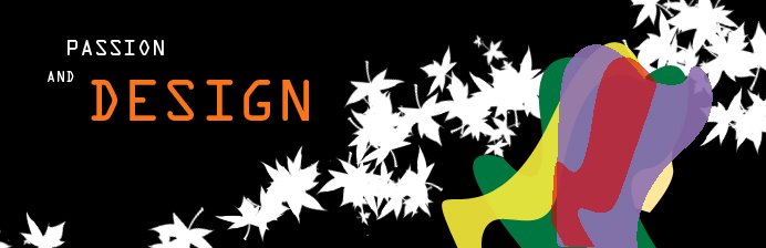


At first, I has tried with Multu, KissMe and TheKingAndTheQueen fonts for the title because they look as to wind about as the flow of brushes, but then I think it's too busy, decrease the stand out of the brushes and don't make the title recognizable. So I come up with a harder, stronger font.
The layouts are made in Photoshop. The main techniques that are used are bruhes and opacity.
1 nhận xét:
I like your work very much. Those design are such classical, old-fashioned but the color, pattern ( maybe brush) and the arrangement give more clear view and space for design-breath than your previous works. They work well together! However, I just wonder how you could make the text more interesting following the "unity" :-?
Đăng nhận xét